A crash course in bad UX
I recently flew around Australia.
Between Melbourne, Sydney, and Canberra, there are two major airlines running domestic flights: Qantas and Virgin. Beyond those two airlines, there are a smattering of regional airlines and bargain–hunter–friendly airlines. I'm probably missing some others too. The key thing to note is that it's easy to mistake the Australian airline market as a competitive one. For example, you'd be forgiven for thinking Jetstar could one day compete with Qantas. In fact it's a fully owned subsidiary of Qantas, and will never develop a strategy to take on the flying kangaroo.
Why is this important? First, let's take a detour. I promise it's informative.
A common tech play, at least in Australia, is to amalgamate various pieces of information from different sellers in a market that were traditionally difficult to source and compare, and then surface that information to consumers. I don't know if the play has a common name but there are plenty of successful companies doing it down under: Canstar for financial services, SEEK for the labour market, Carsales for motor vehicles, Finder for all kinds of odds and ends, and one is literally called Compare The Market.
The value prop always boils down to this: the firm has done the legwork identifying alternatives in the market, so you don't waste time on your weekend finding a good deal for your insurance/home loan/job opportunities/mobile phone plan.
In other words: it's a deeply localised and deeply networked search business. In return for surfacing allegedly optimal purchasing decisions, and turning the tables of information asymmetry back in favour of consumers (huzzah!), the company makes money. But how is it monetised?
Ads. Lead referrals (a.k.a ads). Selling tokens of reputation to a listed brand on the site, based on whatever the site's metrics have deemed it to be — a form of brand building. And of course, straight up selling data (source). Notice that in each of these cases, the customer is not you the individual. The customer is one of the many sellers being compared.
So now you know the rough economics of the "market comparison" tech play: it's a variation of a search play, in that it's deeply intertwined with a specific market, and its revenue streams come from firms (not consumers!) in that market. [ed: strictly speaking Carsales operates a two–sided market. But it doesn't stop dealerships from operating in that market, and the mechanics of how information surfaces to consumers are largely the same as the other examples I listed].
Okay, back to aeroplanes.
So to book my flights, I wanted to bounce between a few cities on different dates. I didn't want to collate and compare the various features of flights between different airlines if a service could do that for me. For example: Melbourne has two big airports nearby for domestic flights. The primary one is Tullamarine airport, and the secondary one is Avalon airport. Some airlines only operate out of Avalon. If you mis–book your flights, you risk traveling to and from Avalon. Very painful! Since it's actually closer to the regional city of Geelong than it is to Melbourne, and the state's mass transit system doesn't have bespoke support for either airport. Quirks like this are exactly the kind of thing I wanted to eliminate as quickly as possible.
Enter webjet.com.au. Webjet describes itself as "Australia's #1 Online Travel Agent". Webjet advertises its ability to mix and match airlines on its front page. Webjet has been around for over two decades and is a publicly listed company on the Australian stock exchange. So naturally, I thought it was a safe bet.
Now, I don't want this to be an insensitive name and shame. Webjet was, up until the point I needed customer service, a solid business to patronise. The site loaded quickly on my five year old iPhone. The information given to me, at the point of checkout, was prompt. The information density, high. Payment processing was simple, fast, and effective. I received emails backing up every single piece of information I needed in case the site went down. The site never went down.
Then I wanted to delay one of my flights.
This was when I realised that Webjet wasn't just in the travel agent business. They were in the market comparison tech business. And the incentive structure for those firms is way more skewed than it is for travel agents, even if they look similar on paper. Dear God was I made to suffer. Let's walk through the process of requesting a delay for your booking.
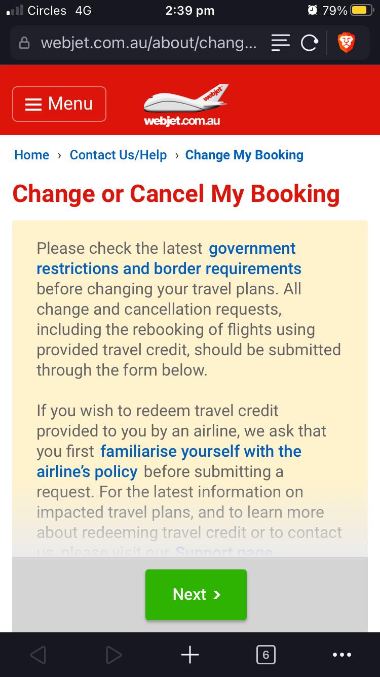
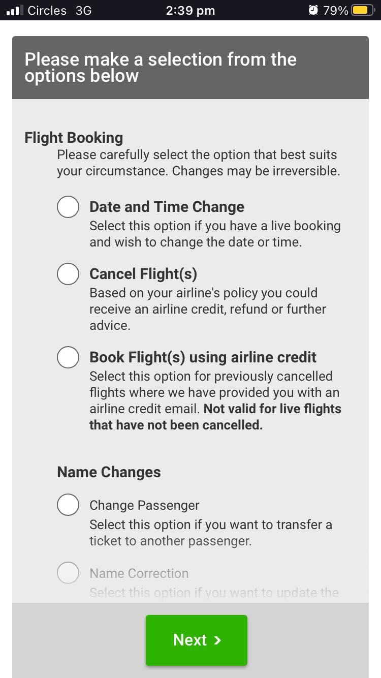
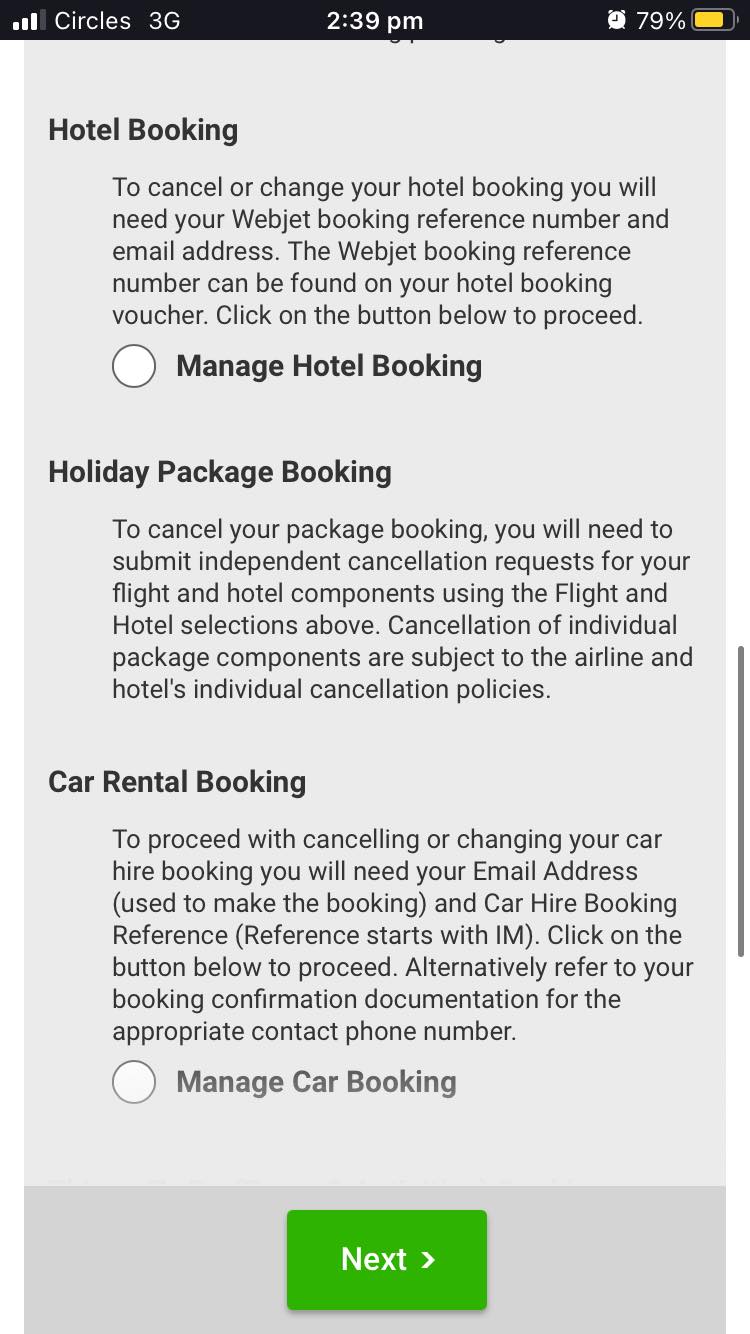
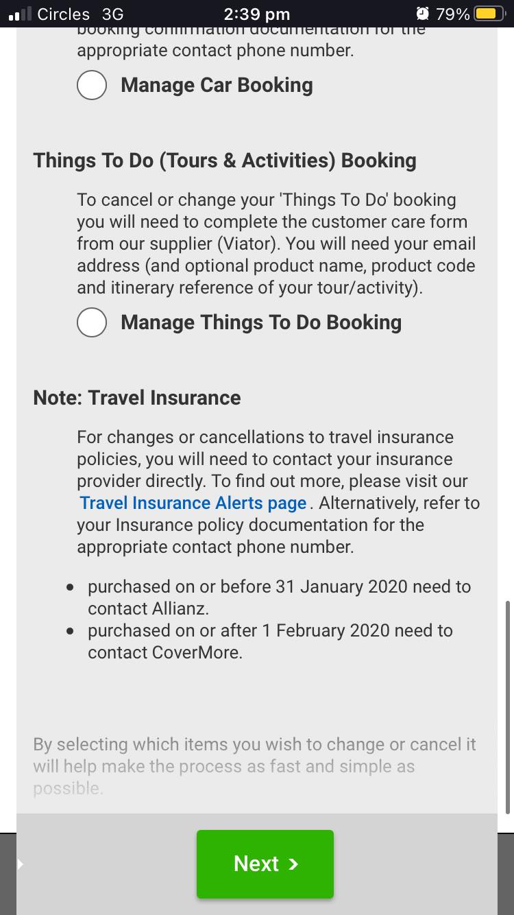
From left to right: this is the first form you're required to submit to begin a request to change a booking. As you can see there's a giant disclaimer that extends below the fold. Almost half of its vertical space is dedicated to (paraphrasing) "please use this form". I wonder why this isn't a <details>? Okay whatever. I skim read all of that anyway, I guess I'll just hit the big green "Next" button since it's not disabled and I just want to get on with my request at this point. Oh wait, it's a <button type="submit"> for a form. Wait, what form?
The form — yes, three screens' worth of my phone's vertical real estate — is dedicated to outlining the various product lines Webjet is capable of organising. For some reason, these mutually exclusive navigation options have been modelled with radio buttons instead of links.
Naturally, there is no need for iconography or visual design outside that of a Word document, since as we all know, black–on–grey text with two font sizes is the easiest to parse visually. Notice that headers and radio button labels are almost identically sized. Now notice that the "Change Passenger" option, even though it is the same modality of user interaction as the "Cancel Flight(s)" option above it, has a different font weight and size. Just not that important, I guess?
Webjet, if your goal was to make me slow down to read each and every single word in this form, because as we all know typography simply can't help us distinguish between alternative user actions, you succeeded.
Of course, some booking alterations are impossible to make via Webjet itself. For these (see: "Travel Insurance") instead of a form option you are met with a disclaimer and handy legalese explaining you should go and figure it out yourself. There are so many easy wins to be had here; it's painful to see them left out. "Please contact Allianz" — why is there no link to do that on this page? Refer to insurance documentation? Can this website not simplify that?
Already some pretty bizarre design choices, but screw it. In for a penny, in for a pound.
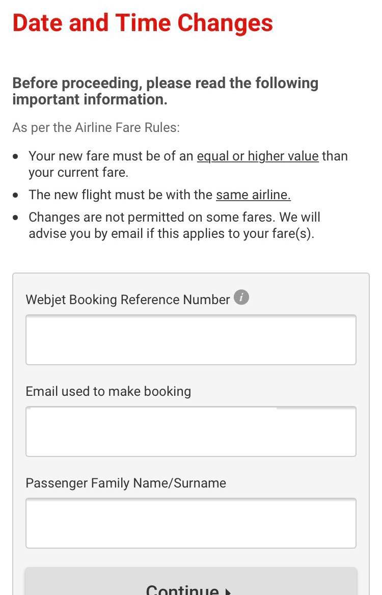
After selecting "Date and Time Change" in the radio button form, you're greeted with another screen to enter in your flight's booking details. Again three rules you personally have to remember. I'm not sure why some fares can't be changed. I'm also totally at a loss as to why just knowing that a fare can't be changed needs to be communicated over email, instead of on the page.
The next big fail is respecting the concept of a 'family name' as a unit of identity in the booking details form. I won't go over the details, but it's enough to know that here be dragons.
So, you finally go through the form. You're thinking,
/"Great, I just filled out two forms. Hopefully there is symmetry in this app, and Webjet filters out irrelevant booking changes, and just shows me options to choose from and the corresponding fees."/
You are wrong. Instead a chat window appears onscreen:
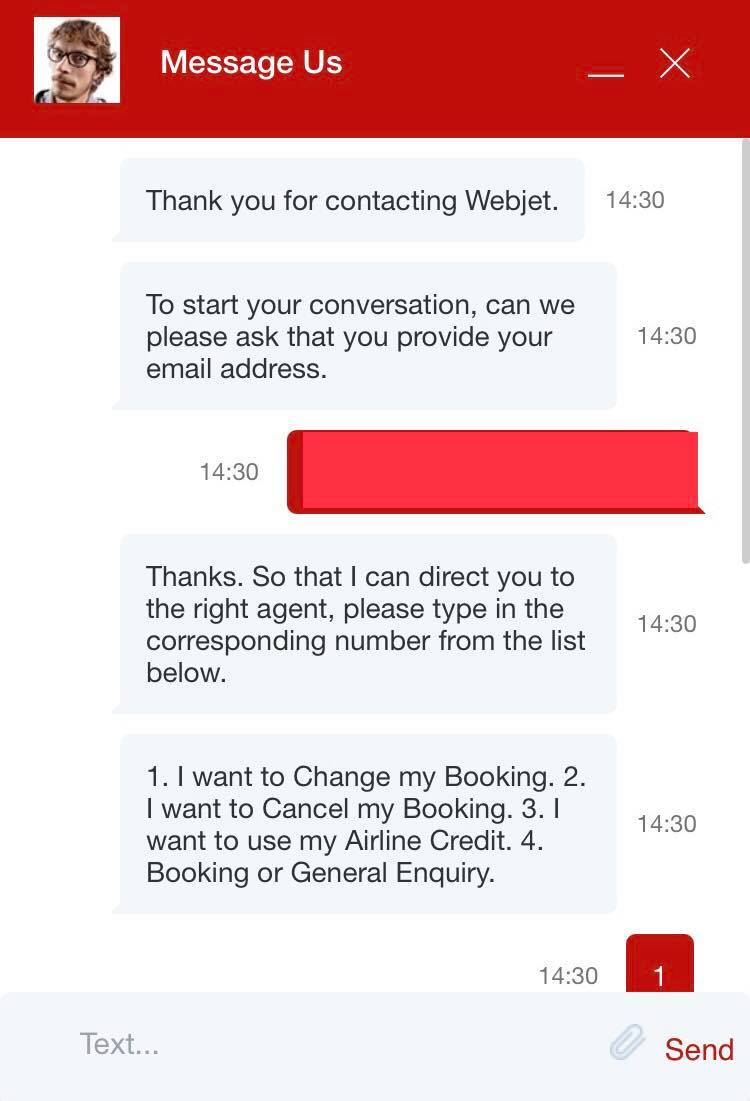
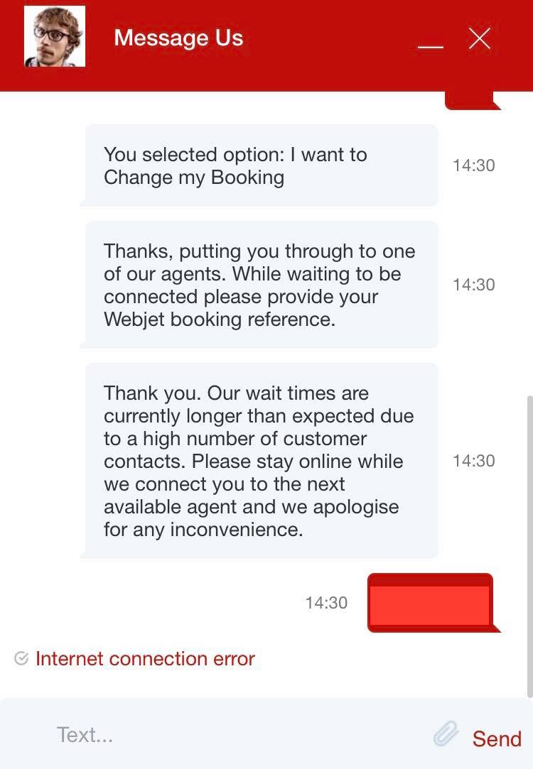
That thumbnail avatar is not for a sales rep. That is a stock image.
No, there is no indication of average wait times. No, you are not told where you are in the queue.
Yes, the email address and booking reference you already gave have to be given again. This time, it's not an <input type="email"> so no, you cannot use autocomplete.
Yes, instead of providing buttons in the chat form, you have to type in and send a number from a set of options. Yes, you run the risk of fat-fingering the input.
Yes, I kept my phone's browser window open and active right up until I was told "Internet connection error". No, there is no follow-up messaging to help you triage or solve this issue. No, refreshing the page does not fix it. It only forces you to go through the entire chat flow again before realising your 4G mobile internet and WebSockets-compatible phone browser just aren't good enough.
This was where I gave up. I did attempt to use their phone service. Of course, the customer support phone number was found exclusively in a PDF attachment of an email I received from Webjet. I resolved to spend the little time I had left with loved ones and hung up instead. That one's on me.
So what do we learn from this?
Firstly — as a heuristic — if a company's incentive structure runs counter to your best interest, expect their customer support to be awful. I'm sure there are plenty of examples around the internet to corroborate this. No matter how well optimised the sales funnel is, no matter how tight that UX is on the path to purchase, the post-purchase side of the application will be hell.
Secondly — Webjet sucks. Points in their favour: the site is performant and reliable, in the engineering sense. Their email comms are thorough. But the end-to-end user experience is lacking. If you ever need a tell, some kind of sign, that you're not in the company's best interest, there it is. There could be all kind of reasons behind this. I'm sure that Webjet's longevity as a publicly–traded company doesn't help its product execution; I'm imagining death by a thousand compliance cuts in the best case, and company politics in the worst. Cue Steve Jobs quote about product versus sales.
This won't apply to everyone but if a company's product is pernicious or inconsistent in its treatment of me, the user, I'm out of there.
Thirdly — and this one is purely speculative — consistently strong UX, UI, product, and design skills are wanting in Australia. We have a long way to go to develop a reputation for exceptional product designs and user interfaces, and to build and support the institutions that support that reputation. I personally would love to take pride and take part in a better direction here but I honestly haven't done the homework on where to begin.
Finally — I am seriously looking forward to seeing holes poked in and strong counterexamples found against my story on HN.
Fly safe!